
Wayfinding Signage Design Guidelines: The Rules That Make Signs Instantly Clear

We have all experienced the frustration of navigating a poorly marked hospital, a sprawling university campus, or a complex civic building. When people struggle to find their way, the consequences are real: missed appointments, stressed visitors, and staff members who spend half their day acting as tour guides.
Effective wayfinding signage design goes far beyond just hanging a plaque on a wall or choosing a nice font. It is the strategic planning of an entire environment, combining directional signage services, architectural graphics, and spatial logic to guide users intuitively. When a wayfinding system is designed correctly, it becomes invisible. People simply know where to go. Here are the core design guidelines and rules that make complex physical spaces instantly clear.
What Is Wayfinding Signage Design?
Wayfinding signage design refers to the planning, strategy, and creation of physical systems that help people navigate built environments.
While signage design focuses on the visual and physical fabrication of individual signs (materials, typography, layout), wayfinding design takes a broader, systems-level approach. It defines the entire navigation strategy, including traffic routes, decision points, and information hierarchies. In short, signage is the component; wayfinding is the logic that dictates how all those physical components work together alongside the architecture.
Why Clear Wayfinding Is Critical for Complex Facilities
Large facilities such as multi-wing healthcare centers, university campuses, and mixed-use developments have multiple entry points and dense destination clusters. Without a structured wayfinding system, these environments fail to function as intended.
Elevated Visitor Experience: Clear signage removes uncertainty. When users can find their destination quickly, they feel confident and less stressed, allowing them to focus on their actual purpose.
Operational Efficiency: When visitors get lost, staff members step in as default tour guides. A strong wayfinding system dramatically reduces staff interruptions, streamlines visitor flow, and mitigates safety risks in high-traffic areas.
Accessibility and Compliance: Wayfinding design must support accessibility and comply with strict ADA standards. This includes proper mounting heights, high-contrast colors, and tactile Braille elements, ensuring spaces are inclusive while mitigating legal risk.
Core Principles of Effective Wayfinding
At its core, a successful wayfinding system relies on removing uncertainty. To achieve this, several non-negotiable principles must be applied:
Information Hierarchy: Users should never have to read a paragraph to know where to turn. Define what people need to know at each specific stage of their journey. Prioritize major destinations (like "Emergency" or "Main Lobby") and visually separate secondary information.
System-Wide Consistency: A navigation system must follow strict visual and structural rules. Consistent use of materials, colors, typography, naming conventions, and symbols builds subconscious familiarity.
Simplicity and Speed: People read wayfinding signs while moving. Straightforward layouts, high-contrast typography, and universally recognized pictograms allow users to process information at a glance.
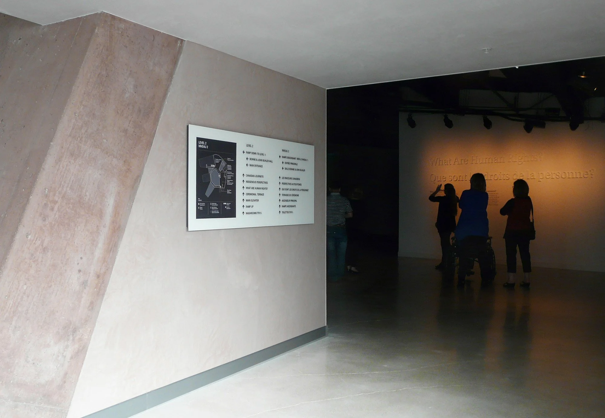
Sightline Optimization: A beautifully fabricated sign is useless if it is placed outside a natural sightline. Signs must be positioned at key decision points (intersections, elevators, entry zones) and angled for optimal visibility based on human behavior.
4 Types of Wayfinding Signs
A cohesive, physical navigation system relies on four specific types of signage working in harmony:
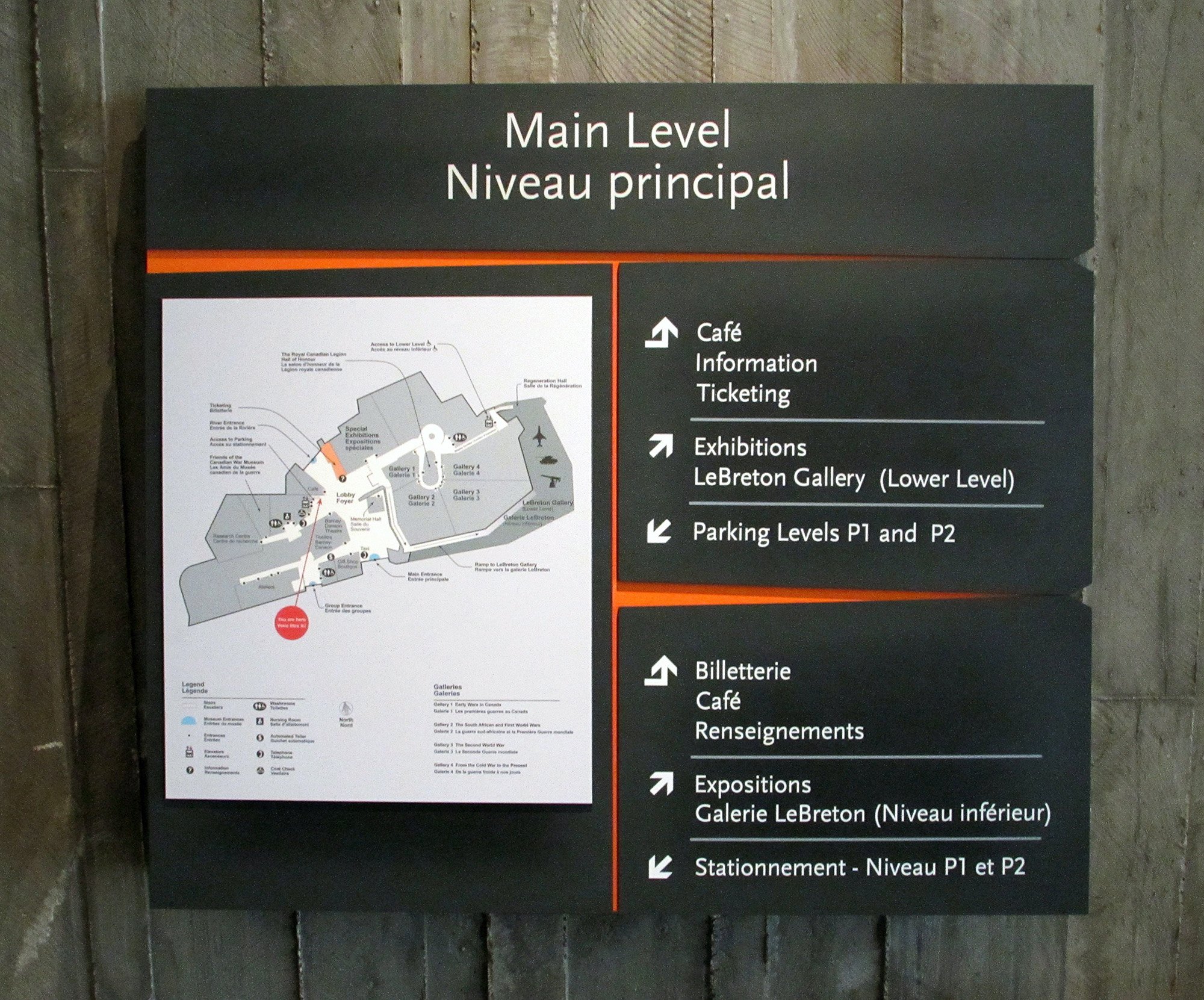
Directional Signage: The bread and butter of navigation. These include arrows and route markers placed at decision points to keep users moving along the correct path.
Identification Signage: These mark specific destinations, such as room numbers, department names, or donor recognition walls, to confirm to users that they have arrived at the intended location.
Informational Signage: Broader overviews such as campus maps, structural directories, and tactile floor plans that help users understand the overall layout of the environment.
Regulatory & ADA Signage: Signs that communicate safety protocols, rules, and legal accessibility standards.
The Strategy-Led Design Process
The biggest mistake facility managers and architects make is treating signage as a late-stage afterthought. Standard templates and production-only vendors often fail when faced with unique architectural challenges.
Designing a system that actually works requires a proven, strategy-led approach. At Nicolson Associates, we utilize a rigorous three-step framework for complex environments:
1. Align on Goals
The process must begin with understanding people, places, and processes. Before a single sign is designed, a strategic firm will conduct stakeholder interviews, review architectural floor plans in detail, and conduct thorough site surveys to map behavioral insights and traffic flow.
2. Create the System
Once the strategy is locked in, design teams develop a clear wayfinding framework. This includes defining messaging hierarchies, establishing naming conventions, selecting typography, and creating environmental graphics that visually align with the building's architecture and the organization's brand identity.
3. Support the Build
Whether a project calls for comprehensive bid packages or a full turnkey design-build approach, this phase brings the system to life. It involves selecting durable, environment-appropriate materials (from outdoor architectural metals to interior acrylics) and managing the complex logistics of nationwide permitting, fabrication, and installation.
Measuring Success & Scalability
How do you know if your wayfinding signage is working? The metrics are surprisingly human: fewer people asking the reception desk for directions, reduced navigation times, and an overall smoother operational flow.
Furthermore, as campuses grow or building layouts change over time, a well-planned wayfinding framework enables easy updates without requiring a costly, total overhaul. Scalability is built into the strategic foundation.
Bringing Clarity to the Places That Matter
Effective wayfinding signage design requires deep planning, architectural alignment, and precise execution. By choosing a partner that prioritizes early strategy and understands the profound impact of physical environmental design, you can create intuitive spaces that support your people, your operations, and your architecture.
Ready to bring structure and clarity to your complex space? Start the conversation with the wayfinding and experiential design experts at Nicolson Associates today.
FAQs
1. How do you design a wayfinding signage system for a complex facility like a hospital or campus?
Start with a site analysis and user flow mapping to understand how people move through the space. Define key entry points, destinations, and decision points. Then build a clear information hierarchy and a consistent naming system. The final design should guide users step by step, using directional signage, confirmation signs, and accessible elements to support all users.
2. What factors most affect the readability and effectiveness of wayfinding signage?
Readability depends on typography, contrast, placement, and viewing distance. Font size must match the expected viewing range, and high contrast improves visibility. Placement within natural sightlines is equally important. Even well-designed signs fail if users cannot see them at the right moment.
3. How do you create a consistent wayfinding signage system across large or multi-building environments?
Consistency comes from establishing design standards early. This includes typography, color coding, symbols, and naming conventions. A centralized information architecture ensures that all signage follows the same logic. Documentation and guidelines help maintain consistency during implementation and future expansions.
4. What is the role of information hierarchy in wayfinding signage design?
Information hierarchy determines how content is organized on each sign. It prioritizes critical directions first and reduces unnecessary details. A clear hierarchy allows users to quickly scan and understand information, especially in high-traffic environments where decisions must be made in seconds.
5. How can wayfinding signage be designed to meet accessibility and ADA compliance requirements?
Accessible wayfinding signage includes proper mounting heights, tactile text, Braille, and high-contrast visuals. Designers must follow ADA guidelines for character size, spacing, and placement. Inclusive design also considers clear language, universal symbols, and logical navigation paths so all users can move independently.