
ADA Compliance for Wayfinding Signage: What Building Owners Need to Know
Effective wayfinding solutions allow every visitor, regardless of ability, to navigate a physical environment with confidence, independence, and clarity. It is a cohesive strategy that bridges the gap between architectural signage, tactile elements, and directional logic to create a truly accessible environment.
For building owners, implementing ADA-compliant wayfinding is more than a legal requirement under the Americans with Disabilities Act; it is a critical component of the user experience. Poorly planned signage leads to visitor frustration, increased pressure on staff, and significant retrofit costs to achieve legal compliance, whereas a superior approach integrates accessibility standards into a holistic wayfinding signage plan from the very beginning.
What Are ADA-Compliant Wayfinding Systems?
ADA wayfinding refers to specialized signage and navigation tools designed to help individuals identify spaces and follow routes through public areas. It applies to all "built environments," including complex healthcare campuses, sprawling educational institutions, sprawling civic spaces, and modern corporate workplaces.
A fully compliant system does not rely on a single type of sign. Instead, it connects a variety of elements:
Interior and exterior signs work together to create seamless transitions from the street to the destination.
Tactile characters and Braille signage specifically engineered for permanent room identification.
Visual and directional signs for confidently navigating long corridors, intersections, and large open spaces.
Identification signs prominently featuring the International Symbol of Access to highlight clear travel paths and accessible amenities.
Wayfinding systems are not just about scattering individual ADA signs throughout a building; they rely heavily on message hierarchy and architectural integration. For example, an ADA-compliant restroom sign provides tactile identification at the final destination, while a broader directional sign guides the visitor toward that hallway. Both must work in perfect harmony to provide an effective wayfinding system that feels intuitive to the user.
The True Impact of Accessible Design in the Built Environment
Thoughtful design reduces friction for those with mobility or cognitive challenges, particularly for individuals with visual impairments. However, creating an inclusive environment does far more than just meet basic code; it fundamentally improves the spatial experience for the general public.
When a building owner prioritizes accessible design, they actively reduce visitor confusion in complex, multi-level layouts. They improve facility circulation and traffic flow, preventing bottlenecks at major intersections or elevator banks. Most importantly, providing clear, predictable guidance for people who are blind or have low vision ensures that a facility provides equal access and dignity to every person who walks through the door. Good wayfinding acts as a silent guide, answering questions before they are even asked.
Which Wayfinding Signs Must Meet ADA Regulations?
A common misconception in facility management is that adding Braille to every placard creates instant ADA compliance. In reality, strict accessibility guidelines dictate that requirements vary significantly based on the sign's specific function and location within the building. Building owners must differentiate between signs that require tactile feedback and those that only require visual clarity.
Signs Requiring Full ADA Compliance (Tactile & Braille)
Tactile elements and Braille are mandatory in all permanent rooms and spaces. If a room's function is not likely to change, it requires full compliance. This includes:
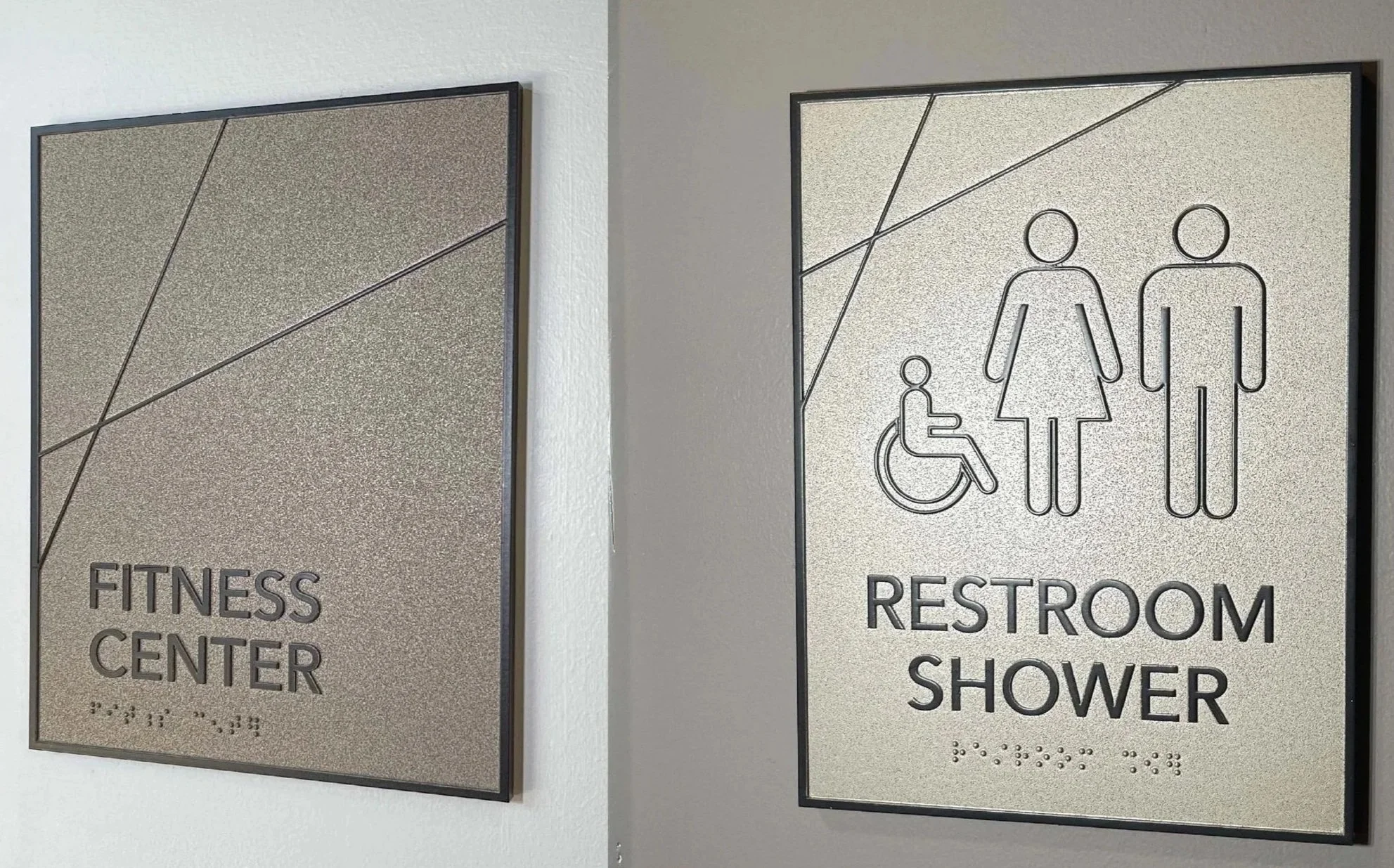
Restrooms, elevators, and stairwells.
Exit doors, exit routes, and required floor numbers.
Permanent room numbers and identification (e.g., "Conference Room A", "Electrical Room", "Utility Closet").
Accessible entrances, accessible parking spaces, and passenger loading zones.
Signs with Visual-Only Requirements
Certain sign systems may not require raised text or Braille but must still meet strict, legally binding standards for visibility and readability. These signs must be designed to be easily legible from a distance. Examples include:
Building directories, maps, and cafeteria menus.
Temporary signage (typically defined as being in place for fewer than 7 days).
Overhead directional signs and flag-mounted corridor signs.
Critical Design Requirements for ADA Solutions
Achieving compliance means paying strict attention to the overall design, fabrication methods, and precise installation of your compliant signs. A failure in any of these technical details can result in a failed inspection or a frustrating user experience.
1. Tactile Characters & Typography
Tactile signs must be readable by touch, which requires strict adherence to typographic rules. ADA regulations require uppercase, simple sans-serif fonts with specific character spacing (kerning) and proportions. Decorative elements, excessively bold weights, or script fonts, while visually appealing for branding, can lead to compliance failure if used for permanent room IDs. The raised text must be distinct, elevated by at least 1/32 of an inch, and highly legible to the fingertips.
2. Grade 2 Braille Signage Fabrication
ADA standards strictly require Grade 2 Braille, which incorporates contractions to make reading faster and more efficient for the user. It must be placed directly below the corresponding text with a domed, rounded shape—flat or pointed Braille dots are strictly non-compliant. High-quality fabrication matters immensely here; the substrate material and the raster beads used to create the Braille dots must remain intact and legible over time, withstanding years of heavy physical interaction and cleaning protocols.
3. Visual Contrast & Non-Glare Finishes
Color contrast is essential for visitors experiencing any level of visual impairment. ADA regulations require significant contrast between text and background, usually light text on a dark background or dark text on a light background, aiming for maximum contrast (ideally 70% or higher). Furthermore, a non-glare finish is legally required. Glossy or highly reflective materials create "halation" (a blinding glare) that severely reduces readability under bright overhead facility lighting or near sunlit windows.
4. Spacing, Mounting Heights, and Locations
Consistency in placement is a strict legal requirement. ADA wayfinding signs must adhere to specific mounting heights; the baseline of the lowest tactile character must be exactly 48 inches above the finished floor, and the baseline of the highest character must be a maximum of 60 inches. Additionally, signs are typically placed on the latch side of the door. This predictable spacing and strict adherence to heights and locations allow a person who is blind to safely locate the sign by running their hand along the wall, without the danger of being struck by an outward-swinging door.
Navigating SpecificALLY Built Environments
The application of ADA-compliant wayfinding shifts depending on the nature of the facility. Different spaces carry different navigational stressors and require tailored wayfinding solutions.
Government facilities must meet the highest accessibility standards explore our wayfinding for government and public service buildings that integrates ADA compliance into every element.
Healthcare Facilities and Campuses
In hospitals, patients and families are often under immense stress, making intuitive wayfinding signage a matter of operational urgency. ADA wayfinding signs here must flawlessly connect parking structures, main entrances, department wings, and individual patient rooms. Clear, highly visible directional signs combined with strict adherence to ADA room identification ensure that medical staff spend less time giving directions and more time providing care.
Educational Institutions
Universities and K-12 schools deal with sprawling layouts and a mix of permanent and rotating populations. Implementing ada compliant signs across multiple buildings requires a unified standard. From identifying accessible dormitory entrances to marking specific laboratory room numbers, the system must provide equal access for students and faculty with disabilities while gracefully guiding first-time visitors through complex public spaces.
Corporate Offices and Civic Buildings
In corporate headquarters and government centers, the challenge is often balancing high-end architectural aesthetics with strict legal compliance. These facilities require interior signs that guide visitors from the lobby entrance to specific departments, conference rooms, or service desks. Here, accessibility must be seamlessly woven into the building's architectural fabric.
ADA compliance is especially critical in medical settings, see how our healthcare wayfinding design integrates accessibility into every sign, surface, and decision point.
The Intersection of Digital Wayfinding and Physical ADA Signs
Modern facilities frequently utilize digital kiosks, touchscreens, and interactive maps to help visitors navigate. While digital wayfinding is a powerful tool for updating and routing visitors, it cannot replace physical ADA signs.
Digital tools must be viewed as enhancements, not as substitutes. An interactive lobby directory might guide a visitor to the third floor. However, the facility is still legally obligated to provide physical, tactile characters and Braille signage at the elevator, the stairwell, and the final permanent room destination. When digital and physical systems are planned together, they create solutions that are both dynamic and comprehensively accessible.
Balancing Brand Identity with Custom Signage
A pervasive myth in architectural design is that ADA-compliant wayfinding must look utilitarian, institutional, or visually unappealing. Compliance does not mean sacrificing your brand identity.
Custom designs can beautifully integrate accessible design principles. By carefully selecting compliant fonts, using custom-painted non-glare finishes, and incorporating brand colors that still meet high-contrast requirements, you can achieve a sophisticated look. At Nicolson Associates, we ensure that your custom signage reflects your brand’s unique visual environment while strictly adhering to code, proving that a space can look incredibly polished while providing safe, equal access to all users.
Strategic Planning: From Signage Audit to Installation
Implementing a successful wayfinding program requires a proactive, strategic approach. Treating ADA signage as an afterthought, something ordered just weeks before a building opens, almost always leads to aesthetic mismatches, installation errors, and code violations.
A thorough signage audit is the first step. This involves walking the facility to identify complex decision points, assessing existing compliant signs, and mapping out the required accessibility standards for every permanent space. From there, a comprehensive sign schedule and location plan are developed, ensuring that every piece of raised text, every Braille dot, and every directional arrow serves a distinct purpose.
Whether you are managing a massive healthcare campus, a university, or a modern corporate headquarters, your ADA-compliant wayfinding should support the entire visitor journey. Don't settle for a basic sign vendor when you need to create solutions that stand the test of time and legal scrutiny. A strategic experiential design partner ensures your building is not only equipped with ADA-compliant signs but also features a beautifully integrated, overall design that is intuitive, legally sound, and welcoming for every single user.
At Nicolson Associates, we partner with architects, facility managers, and building owners to turn confusing environments into clear, accessible spaces. We ensure your facility is not only equipped with ADA-compliant signs but also features a beautifully integrated, intuitive, legally sound, and welcoming overall design for every user.
Ready to eliminate navigation barriers and ensure total compliance?
Stop guessing on accessibility codes and avoid expensive post-construction retrofits. Contact Nicolson Associates todayto schedule a comprehensive signage audit and build a wayfinding strategy that works for everyone.
FAQs
1. How can building owners tell which wayfinding signs need ADA compliance?
Building owners should start by identifying signs for permanent rooms, restrooms, elevators, stairs, exits, accessible entrances, accessible routes, and regulated building features. These signs often need specific ADA features such as tactile characters, Braille, visual contrast, and proper mounting. Temporary signs, directories, and some overhead directional signs may follow different rules, so a signage audit helps confirm which rules apply.
2. Why is Braille alone not enough for ADA-compliant wayfinding signage?
Braille supports tactile reading, but ADA wayfinding also depends on sign placement, raised characters, visual contrast, character height, mounting height, clear floor space, and consistent navigation logic. A sign can include Braille and still create problems if people cannot find it, reach it, or connect it to the rest of the wayfinding system.
3. When should ADA signage be planned during a renovation or new building project?
ADA signage should be planned early in the design or renovation process. Early planning helps teams coordinate room names, sign locations, wall conditions, mounting height, accessible routes, and fabrication details before installation. This reduces the risk of last-minute changes, inconsistent signage, or retrofit costs.
4. Can digital directories and interactive wayfinding replace physical ADA signs?
Digital directories and interactive wayfinding can support navigation, but they usually do not replace required physical ADA signs. Permanent rooms, restrooms, elevators, stairs, exits, and accessible routes often still need compliant physical signage. Digital tools work best when they support the physical wayfinding signage system.
5. What is the biggest ADA wayfinding mistake building owners make?
The biggest mistake is treating ADA signage as a final compliance task rather than as part of the overall wayfinding strategy. ADA-compliant signs must work with visitor paths, decision points, room identification, directional signage, and facility circulation. Planning the system as a whole creates clearer, more accessible navigation.