A visitor steps off the elevator on the fourth floor of a hospital tower. Three corridors branch out, and every wall looks the same. Before she reads a single word, she needs one fast answer: am I in the right part of the building?
Color-coded wayfinding gives her that answer. When a facility chooses its wayfinding colors with care and assigns a consistent color to each zone, route, or level, people can confirm their location at a glance and keep moving. Color does not replace signs. It gives signs a structure that visitors can learn quickly.
This guide explains how color-coded wayfinding works, where it helps most, where it fails, and how to plan a system that stays clear for every visitor, including people who see color differently.
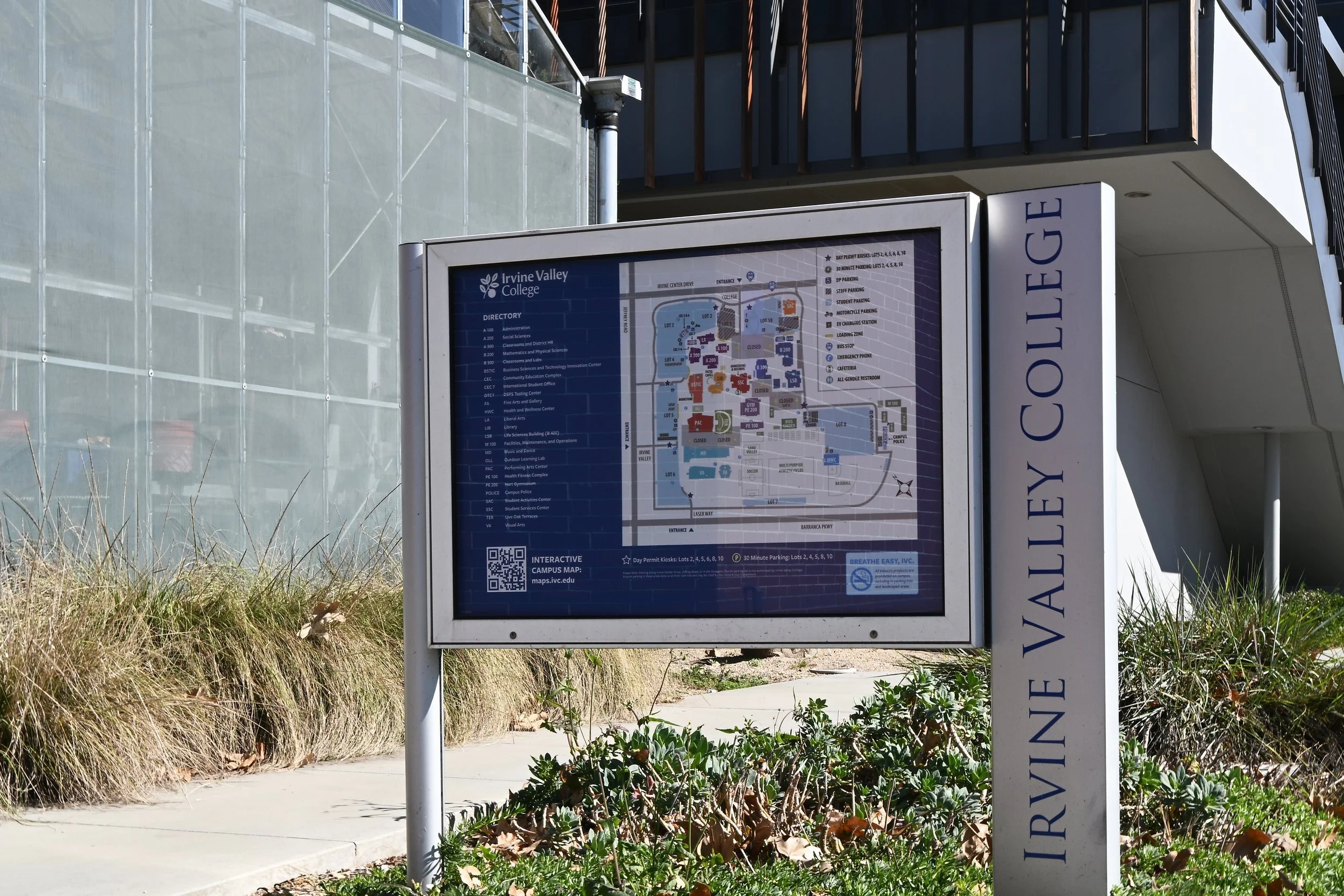
What Is Color-Coded Wayfinding?
Color-coded wayfinding assigns a specific color to one part of a facility, such as a zone, building, floor, or route. The facility then repeats that color on every related sign, map, and architectural cue. Visitors learn the code once and use it everywhere they go.
The key word is system. A blue accent wall in one lobby is decoration. A blue zone that appears on the parking map, the main directory, the elevator lobby, the corridor signs, and the appointment letter is a navigation tool.
Color works best as one layer in a broader wayfinding signage system. Text names the destination. Arrows show direction. Room numbers confirm arrival. Color ties those layers together so visitors can sort information quickly.
Why Color Helps People Navigate Complex Facilities
People rarely read every sign. They scan for something familiar, decide, and move on. A clear color code gives them something to scan for, which reduces the mental effort at each decision point.
Color also makes directions easier to share. A receptionist can say, “Take the Green elevators to Level 3,” instead of describing a route turn by turn. The visitor carries one simple cue instead of a list. This connects to how people form mental maps, a topic we explore why visitors get lost in complex buildings.
In large facilities, color supports three practical goals:
Chunking: Color divides a large building into a few memorable parts.
Confirmation: Visitors can see that they remain on the correct route without stopping.
Communication: Staff, websites, and appointment letters can reference the same simple label.
Four Ways to Apply Color in a Wayfinding System
Most color codes apply to one of four things. Each approach solves a different problem, so the building layout and the questions visitors ask most should drive the choice.
| Approach | How it works | Typical fit | Watch for |
|---|---|---|---|
| Zones or departments | Each wing, tower, or service area gets its own color | Hospitals, multi-wing schools, civic centers | Departments that relocate can break the logic |
| Floors or levels | Each level gets a color, often in elevator lobbies and stairs | Parking structures, mid-rise office and residential buildings | Conflicts if zones also rely on color |
| Routes or paths | A colored line or marker leads to one key destination | Long corridors and a few high-volume destinations | Several lines create a tangle at intersections |
| Districts or buildings | Each building or area of a campus gets a color | University campuses, medical campuses, civic districts | Requires tight exterior and interior coordination |
Our guidance: give hue one primary job. If color identifies zones, use numbers or letters to identify floors. When one color tries to mean two things, visitors stop trusting it.
How to Design a Color-Coded Wayfinding System
A strong color code starts with planning, not paint. Work through the steps below before anyone selects a swatch.
1. Map Destinations and Decision Points
List the destinations visitors search for most and the points where they must choose a direction. Study how people arrive: parking, transit, drop-off, and each entrance. Use color to organize these real journeys, not the organizational chart.
This step often shows that a building needs fewer zones than expected. Visitors care about where they are going, not about every internal department boundary.
2. Decide What Color Will Identify
Choose zones, floors, routes, or districts based on what you learned. A hospital with three towers may color the towers. A parking structure may color its levels. A campus may color districts and let room numbers and names guide visitors inside each building.
3. Choose Wayfinding Colors That Stay Distinct
Keep the palette short. Every added color asks visitors to tell one more hue apart and remember one more meaning. Choose colors that differ clearly in lightness as well as hue, so they still read as different in poor lighting or to visitors with color vision deficiency.
Give each color a plain name that people can say out loud, such as Blue, Green, or Orange. If staff cannot name a color with confidence, visitors will not remember it. Avoid labels like “Teal 2” or paint names like “Harbor Mist.”
4. Never Let Color Work Alone
Pair every color with a name, letter, number, or symbol on your color-coded signs. “Blue Zone B” works for a visitor who sees blue, a visitor who cannot tell blue from purple, and a staff member who gives directions over the phone. This redundancy turns a visual cue into an accessible system.
5. Coordinate Color With Brand and Architecture
Wayfinding colors must work alongside interior finishes and brand standards. A zone color may clash with a logo or disappear against warm wood paneling. Test colors on real materials under real lighting before you finalize the palette.
Reserve red and other safety colors for life safety and regulatory messages. That restraint helps them keep their meaning.
6. Document the Code
Record each color specification, its meaning, and every place it appears in a signage standards manual. Documentation protects the system when new wings open, vendors change, or facilities staff replace a faded panel years later.
Designing Color Codes for Accessibility
Color vision varies more than many planners expect. The National Eye Institute reports that about 1 in 12 men have color vision deficiency, and the most common type makes red and green hard to tell apart. Color vision can also decline with age, often because of cataracts. In a hospital or senior living community, many visitors may see your palette differently than the design team does.
Accessibility standards also shape how color appears on signs. The U.S. Access Board’s guide to the ADA Standards for signs explains that the Standards do not specify colors for signs. Instead, they require characters to contrast with their background, either light on dark or dark on light, with a non-glare finish. The guide adds that higher contrast improves legibility, especially for people with low vision.
That distinction matters for color-coded systems. A colored zone panel can carry the code, but the text on it still needs strong contrast. Pale yellow text on a medium green panel may match the palette and still be hard to read.
Use these checks before you approve a palette:
View the palette in grayscale. If two zone colors look alike, change one.
Test the palette with a color vision deficiency simulator.
Avoid red versus green as the only difference between two zones.
Place critical text in high-contrast combinations, and use color in a band, panel, or icon field.
Confirm sign requirements with your accessibility consultant or code official. Our ADA compliance guide for wayfinding signage covers the basics.
Color-Coded Wayfinding in Healthcare and Campus Settings
Healthcare facilities often benefit from color coding because visitors arrive stressed, distracted, or unwell. A clear zone color lets a patient confirm the right tower from the parking garage onward. It also gives schedulers a short phrase to include in appointment instructions. In healthcare wayfinding, color works best as one layer alongside clear naming, consistent room numbers, and well-placed directional signs.
Campuses use color differently. Universities and medical campuses often color districts or parking areas so visitors can match an exterior map to what they see on arrival. Inside each building, room numbers and names take over. Plan that handoff carefully so visitors don't encounter two competing color languages at the front door.
Common Mistakes That Weaken Color Coding
Most failed color systems share a few patterns:
Too many colors: Visitors stop telling similar hues apart.
One color, two meanings: Floors and zones compete for the same cue.
Organizational chart logic: Colors follow departments that relocate, so the code breaks after the next move.
Partial rollout: One wing adopts the new code while another keeps old signs.
No maintenance plan: Faded or mismatched replacement panels erode trust in the code.
How to Tell If Your Color Code Works
Test before full installation. Ask first-time visitors to find several destinations using only the signs, and note where they hesitate. Ask front desk and security staff which directions they give most often. If staff stop mentioning the colors, the code has likely lost its meaning.
After installation, track the same signals over time: repeat direction requests, complaints about finding departments, and late arrivals. Schedule a review whenever a department moves or a new wing opens.
Plan a Color-Coded System Visitors Can Trust
Color-coded wayfinding works when it acts as a promise. Every time a visitor sees blue, it must mean the same thing in the same place, across signs, maps, screens, and conversations. That consistency takes coordinated planning across architecture, brand, accessibility, and operations.
Nicolson Associates helps owners, architects, and facility teams plan wayfinding systems where color, naming, and room numbering work together. Talk with our team about your space, your visitors, and your project goals.
Frequently Asked Questions
1. How many colors should a color-coded wayfinding system use?
No single number fits every facility. The right count depends on building size, layout, and how many areas visitors truly need to tell apart. Test a draft palette with first-time visitors and cut any color that people confuse or forget.
2. Is color-coded signage required by the ADA?
No. The ADA Standards do not require color coding or specify sign colors. If you use color, signs must still meet the visual and tactile criteria for their sign type, so color choices should never weaken text contrast.
3. Which colors are hardest for people with color blindness to tell apart?
Red and green cause the most trouble because red-green deficiency is the most common type. Blue-yellow deficiency is less common but real. Clear differences in lightness, plus text or symbols, protect the code for everyone.
4. Can we use our brand colors for wayfinding zones?
Sometimes. Brand colors can work when they stay distinct from one another and support readable contrast. A small brand palette rarely provides enough distinct hues for every zone, so many systems pair brand colors with a supporting wayfinding palette.
5. Do painted floor lines work better than wall or overhead signs?
Floor lines guide well along a single route to a high-volume destination. They become confusing when several lines cross, and they need regular upkeep in busy corridors. The U.S. Access Board guide permits floor-mounted directional signs only as redundant signs, so plan them as a supplement to compliant wall or overhead signs.